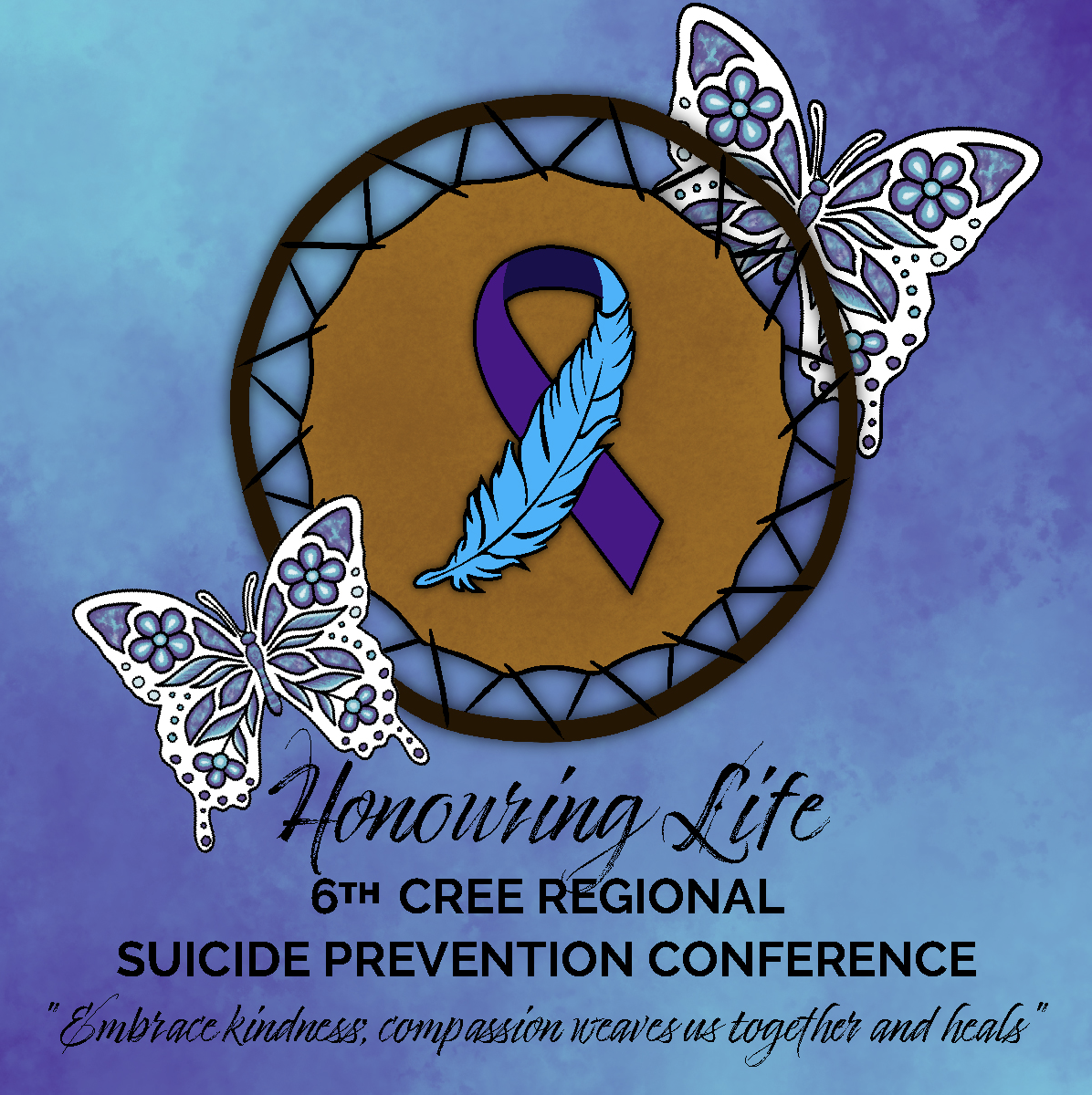
Honouring Life: Event Branding for the 6th Cree Regional Suicide Prevention Conference
Introduction
This project involved creating the full event branding for the 6th Cree Regional Suicide Prevention Conference, hosted in Ouje-Bougoumou, February 24–27, 2025. As the lead designer, I developed a cohesive visual identity across multiple formats: two retractable banners, a stage banner, a poster, a helpline magnet, and event stickers.
Client: Cree Regional Suicide Prevention Conference Committee
Project type: Event Branding & Print Design
Programs used: Adobe Illustrator, Photoshop, InDesign, Procreate
Client: Cree Regional Suicide Prevention Conference Committee
Project type: Event Branding & Print Design
Programs used: Adobe Illustrator, Photoshop, InDesign, Procreate
The Challenge
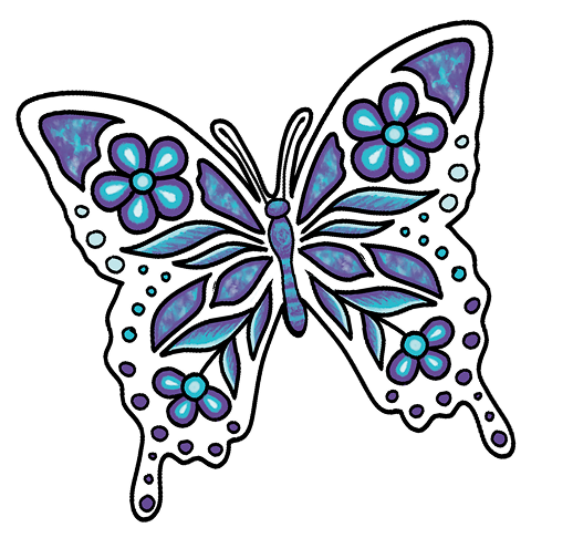
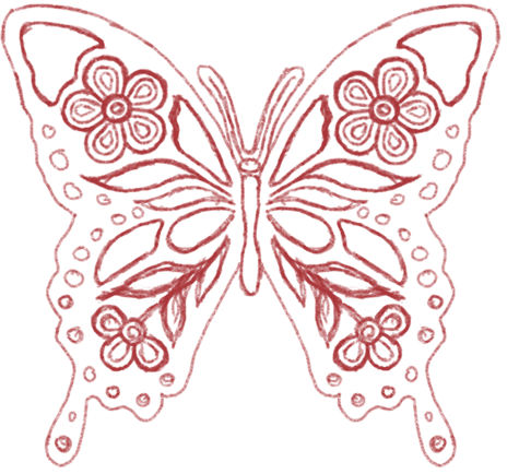
The goal was to design impactful, culturally resonant visuals for an event addressing one of the most sensitive and urgent issues in Cree communities: suicide prevention. The designs needed to balance hope and healing with professional clarity, while ensuring visibility across diverse print sizes and formats.Creating symbolic graphics (such as butterflies) entirely by hand.Blending a calming yet vibrant colour palette to represent both grief and resilience.Honouring my personal motivation for this project — the passing of my younger brother, while channelling that experience into a visual language that could uplift others.
The process
Research: I looked into traditional Cree symbolism and healing imagery, drawing inspiration from butterflies as symbols of transformation, Suicide prevention colours for renewal, and cultural motifs to ensure authenticity.Ideation: I began with hand-drawn sketches of butterflies, experimenting with different wing patterns and gradients. I also assembled mood boards around themes of compassion, connection, and light emerging from darkness.Execution: The final graphics were created entirely by me — no stock elements. I refined the butterfly motif, crafted a blended gradient palette, and applied consistent typography across banners, posters, and magnets. Each piece was designed to scale while retaining emotional impact.
The Solution
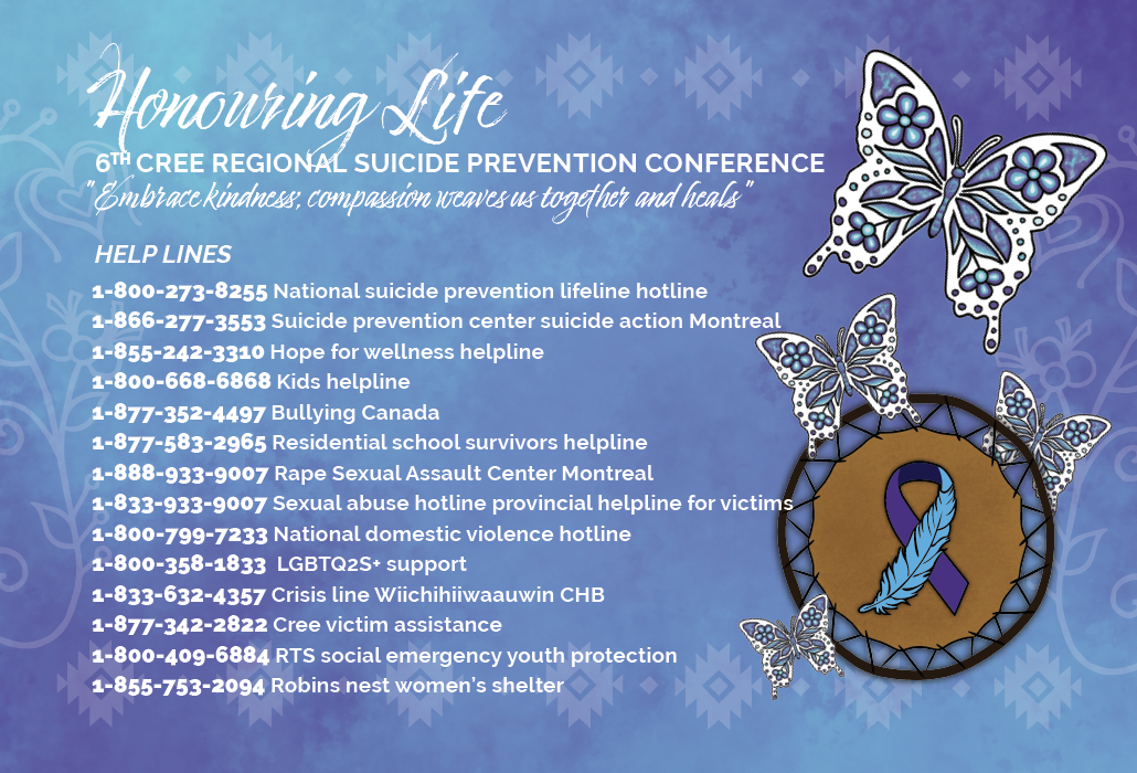
The final deliverables included:Stage Banner and Retractable Banners with the event tagline: “Embrace kindness; compassion weaves us together and heals.Poster outlining the 4-day program, speakers, and workshopsHelpline Magnet listing suicide prevention and support resources, designed to extend the conference’s impact beyond the event itself.Each design choice reinforced the event’s mission: to weave compassion, connection, and cultural healing into community spaces.
The Outcome & Learning
This project strengthened my skills in:Visual identity and branding systems, ensuring cohesion across multiple print materials.Emotional design and colour storytelling, using gradients and imagery to balance grief and hope.Cultural symbolism and authenticity, illustrating by hand to honor Cree art forms while communicating modern clarity.The committee praised how the event visuals felt uplifting, powerful, and culturally grounded, capturing the message of healing and compassion at the heart of the conference.
Reflection
If I revisited this project, I would expand the identity into motion graphics and social media assets to reach a wider audience and continue spreading awareness after the event.This project reaffirmed that design can be an act of healing and remembrance. It reminded me that creativity is not just a skill — it’s a way to transform pain into purpose, honour loved ones, and uplift the community through culture and compassion.

© 2025 Mariah’s Creeative Studio